We improved the second title card at the end of the film. It used to be orange and have a black stroke, now it is a larger only yellow font. This was a more aesthetically appealing improvement.
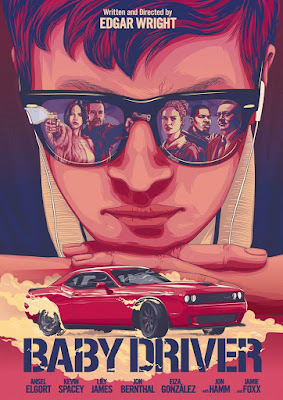
The audience of baby Driver is similar to that of our Film. The audiences are similar because it features a fast paced action crime thriller that stars a young male main character lead. This audience is most likely the young adult male category. The film was advertised with posters, these were hung in movie theaters and film festivals, which generated awareness of the film in the demographic of movie enthusiasts. Two different trailers of the film offered two different vibes which could have interested those different sides of the spectrum. These were shown on television, YouTube, and other social medias. The film also had cross promotions with other companies, Alpha Industries created movie inspired apparel, Subaru used the movie to advertise it's WRX model, and Urban Outfitters, had an elusive movie t-shirt and soundtrack vinyl. We would like to use all these forms of advertisement especially the movie inspired clothes line.
The criticism I received was constructive. The film did not fit the entire screen, so I was given instructions on how to go about doing so. We were also given the suggestion that one of our characters should jump into his car rather than open the door, this would add to the thrill of the action scene. This will however require re shooting, and may not be possible due to complication with the car. I was also told to enhance the color, but this had already been done to the maximum and would be impossible.


Comments
Post a Comment